World Time Zone Map Explained
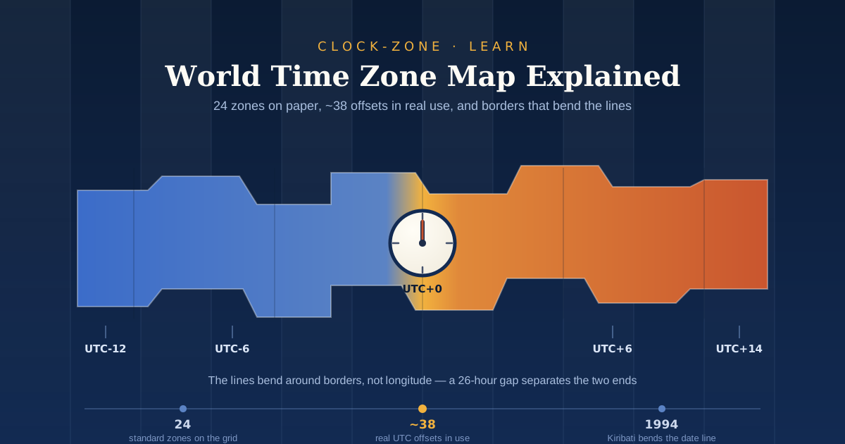
TL;DR: A world time zone map divides Earth into vertical bands, and each band is labelled with its offset from UTC. The bands bend around national borders instead of following longitude, which is why the lines look messy. There are 24 standard zones on paper but roughly 38 offsets in real use, from UTC-12 to UTC+14. Read the offsets, subtract them to get a gap, then confirm with a live tool because daylight saving shifts the picture twice a year.
Open any world time zone map and it looks reassuringly simple. Neat coloured stripes run from pole to pole, each one an hour apart, each one labelled with a number. Twenty-four stripes, twenty-four hours, job done.
Then you look closer. India sits half an hour off the grid. China runs a single clock across land wide enough for five zones. The date line in the Pacific does not go straight down; it swerves east around a group of islands, then swerves back. And a map printed in January is quietly wrong by April, because a third of the world has moved its clocks.
None of this is a mistake in the map. It is the map doing its job, which is to show you where time actually is rather than where geometry says it should be. Time zones were drawn by railway companies and governments, not by mathematicians, and the map carries every one of those decisions.
This guide walks through what each part of the map means, why the lines bend, and how to get a reliable answer when you need one. By the end you will be able to read any time zone map, and you will also know exactly when to stop trusting it.
What Is a World Time Zone Map and How Do You Read It?
A world time zone map is a chart of Earth split into vertical bands, where each band shows a region's standard offset from Coordinated Universal Time. Labels such as UTC+5:30 or UTC-8 tell you how many hours that region sits ahead of or behind UTC. Read the number, not the colour, because colours vary between maps.
Once you know that, the rest of the map decodes quickly.
The vertical bands
The bands come from simple division. Earth turns 360 degrees in 24 hours, so one hour of time equals 15 degrees of longitude. On a map, the vertical lines mark the theoretical zone boundaries spaced 15 degrees apart, which is the grid every real zone is measured against.
Nothing forces a country to sit inside that grid, though. The grid is the starting point, not the rule.
The numbers
Every band carries a UTC offset. A positive number means the region is ahead of UTC, so UTC+9 in Tokyo is nine hours ahead. A negative number means behind, so UTC-5 in New York is five hours behind.
The full range runs wider than most people expect. Offsets stretch from UTC-12 in the far western Pacific to UTC+14 near Kiribati, a spread of 26 hours between the two extremes.
The shading and stripes
Some maps use extra shading for zones that are not a whole number of hours off UTC. On the timeanddate map, for example, diagonally striped areas mark offsets that are not whole hours, which is how India, Nepal, and parts of Australia are flagged.
If a map has no shading system, it is almost certainly rounding those regions to the nearest hour. That rounding is where scheduling errors start.
Why Are Time Zones Measured From UTC?
Every time zone is defined as an offset from Coordinated Universal Time, or UTC, which is the single global reference for civil time. UTC is kept by atomic clocks, reads the same everywhere on Earth, and never shifts for daylight saving. Local time is just UTC plus or minus a fixed offset.
That fixed quality is the whole point. If every country measured time against its neighbour, one change would ripple outward forever. Measuring against a standard that never moves keeps the system stable.
UTC and GMT are not quite the same thing
People use the two terms interchangeably, and for everyday purposes that is fine. Technically they differ. GMT is the older standard, based on mean solar time at the Greenwich meridian, and UTC formally replaced it as the world reference in 1972.
The distinction matters mostly to engineers and broadcasters. If you are booking a call, treat UTC and GMT as the same and move on.
The standard is still being refined
UTC is not frozen. It has been nudged by leap seconds for decades, and that practice is ending. The General Conference on Weights and Measures decided in 2022 to discontinue leap seconds by 2035, which will make long-range timekeeping simpler for software.
For reading a map, none of this changes anything. It is worth knowing that even the zero point on the chart is a living standard rather than a fixed law of nature. If you want to see UTC alongside any city on the map, the live world clock shows both at once.
How Many Time Zones Are There in the World?
There are 24 standard time zones in theory, one for each hour of the day, but roughly 38 distinct UTC offsets are actually in use. The extra offsets come from regions that use half-hour or quarter-hour differences and from Pacific islands sitting near the date line.
This is the question that trips up most people, because both answers are correct depending on what you are counting.
The textbook 24 counts the hourly grid. The real-world figure counts what governments have chosen. Around 38 offsets are in use, from UTC-12 to UTC+14, and the surplus comes from a handful of well-known exceptions.
India runs on UTC+5:30. Nepal uses UTC+5:45. The Chatham Islands sit at UTC+12:45. Those non-standard offsets exist because political and local decisions overrode the neat longitudinal grid, and once one country makes that choice the map has to accommodate it.
If you deal with any of these regions regularly, a time zone converter is safer than mental arithmetic. A 45 minute offset is easy to round away by accident and hard to spot afterwards.
The Map Was Drawn by Railways, Not Geographers
Before the 1880s, most towns set their clocks by the sun. That worked perfectly well until trains arrived and made it impossible to publish a timetable that meant the same thing in two cities.
The person usually credited with fixing it is Sandford Fleming, a Canadian railway engineer. He missed a train in 1876 because of a scheduling mix-up, and the frustration pushed him toward the idea of standard time. His proposal was the grid we still use: 24 zones, each 15 degrees of longitude and one hour wide, counted from the Greenwich meridian.
The railways moved first. North American railways switched to standard time at noon on 18 November 1883, before any government had formally agreed to anything. Diplomacy caught up the following year, when 41 delegates from 25 nations met in Washington for the International Meridian Conference and settled on Greenwich as the prime meridian.
That history explains something the map cannot say out loud. The lines exist because commerce needed them, not because anyone surveyed the planet and found them there.
Why Don't Time Zone Boundaries Follow Straight Lines?
Time zone borders bend because countries prefer to keep their territory on one clock. A zone boundary that split a city, a province, or a rail network would cause more trouble than it solved, so the lines follow political borders rather than longitude.
The result is a map full of detours, and a few of them are dramatic.
China is the clearest example. The country is wide enough to cover roughly five geographic zones, yet the whole of China officially runs on a single clock, with Xinjiang in the far west unofficially keeping its own time two hours behind Beijing. Two clocks, one legal, one practical, coexist in the same region.
Russia went the other way and kept the divisions. Russia spans 11 time zones, and France holds the record at 12 once overseas territories are counted, even though mainland France sits in one.
None of this is accidental. Political boundaries, geography, and local legislation mean real-world zone borders rarely follow tidy longitudinal lines. When a map looks wrong, it is usually because a government made a choice that geometry did not anticipate.
What Is the International Date Line and Why Is It Crooked?
The International Date Line is the boundary in the Pacific where the calendar date changes. Cross it westward and you lose a day; cross it eastward and you gain one. It roughly follows the 180 degree meridian, but it bends to keep island groups and their neighbours on the same date.
The biggest bend was deliberate. When Kiribati became independent, part of the country sat on one side of the line and part on the other, which left government offices a full day apart. In 1994 Kiribati moved the line about 1,000 kilometres east so its whole territory shared one date, and in doing so created the UTC+13 and UTC+14 offsets that had not previously existed.
Samoa did something similar for trade reasons. On moving across the line in 2011, Samoa skipped 30 December entirely, going straight from the 29th to the 31st.
Those choices produce the strangest fact on the whole map. The maximum gap between two inhabited places on Earth is 26 hours, which means somewhere in the Pacific is always on a different calendar day from somewhere else. It also means Kiribati is the first place into every new year, a detail worth remembering if you ever set a countdown timer for a global launch.
Where the Map Goes Out of Date: Daylight Saving Time
Here is the limitation nobody prints on the map. Almost every world time zone map shows standard time, which means it is wrong for part of the year across a large slice of the northern hemisphere.
Fewer countries switch than you think
Daylight saving feels universal if you live in Europe or North America, but it is not. Only around 70 of the world's roughly 195 countries still change their clocks, and they are concentrated in Europe and North America. Most of Asia, Africa, and South America stopped or never started.
The trend runs one way. Russia dropped the switch in 2014, Brazil in 2019, and Mexico in 2022.
The United States may be next. The House of Representatives passed the Sunshine Protection Act by 308 votes to 117 on 14 July 2026, sending it to the Senate. If it becomes law, the country would stay on daylight saving year round unless individual states opt out.
Some regions are not waiting. British Columbia's spring change on 8 March 2026 was its last foreseeable clock change before moving to a permanent UTC-7.
How software keeps up when maps cannot
Your phone gets this right because of a shared dataset. The IANA Time Zone Database is updated whenever political bodies change zone boundaries or daylight saving rules, and end users receive those updates through their operating system and software vendors. Every calendar app, server log, and booking system leans on it.
This is one reason we built Clock-Zone as a browser tool rather than a static reference. A printed map is a snapshot of the day it was made, and there is no way to patch it. A live tool can carry the current rules, which is why it is worth using a converter to check the exact offset before anything important goes in a calendar.
How to Use a Time Zone Map for Real Scheduling
To find the gap between two places, subtract one UTC offset from the other. A city at UTC+9 is eight hours ahead of a city at UTC+1. Add the difference to your local time to get theirs, then confirm with a live tool in case either location is currently on daylight saving.
That last step is not optional. Two cities can be five hours apart in January and six in April without either one doing anything unusual.
The stakes are higher than a missed call. Research on distributed teams found that losing just one to two hours of overlapping work time cut scheduled meetings by 10.7 percent and pushed 43 percent of real-time communication into non-business hours. Getting the overlap window right is a scheduling problem with a real cost attached.
A few habits make it much easier:
- Name the zone in every invite. Write "3pm IST" or "15:00 UTC", never just "3pm".
- Use 24-hour format for anything crossing borders. It removes the entire class of am and pm errors.
- Find the overlap window before picking a time. Aim for a slot inside working hours for everyone, and rotate the awkward slot if that is impossible.
- Recheck the week of a clock change. DST dates differ by country, so a recurring meeting can drift for weeks before anyone notices.
- Do the arithmetic once, in a tool. Use a time calculator to work out the difference rather than counting on your fingers.
The Map Is a Picture of Politics, Not Just Geography
Three things are worth carrying away. First, the numbers matter more than the colours: every zone on the map is just a UTC offset, and reading that number correctly answers most questions. Second, the bends in the lines are not errors but decisions, made by governments that wanted their territory on one clock. Third, any static map is a snapshot, and daylight saving quietly invalidates part of it twice a year.
Clock-Zone was built for exactly that gap. We wanted fast, accurate time tools that live in the browser with no download, no account, and no subscription, so checking the time somewhere else takes seconds rather than a search.
Open the free online clock or the converter, bookmark whichever one you reach for most, and send it to the colleague who keeps scheduling calls at 3am. Reading the map is a useful skill. Not having to do the maths is better.
Frequently Asked Questions
How many time zones are there in the world?
There are 24 standard time zones based on the hourly grid, but around 38 distinct UTC offsets are actually in use. The extras come from regions using half-hour or quarter-hour offsets, such as India at UTC+5:30 and Nepal at UTC+5:45, plus Pacific islands near the date line. The full range runs from UTC-12 to UTC+14.
What is the difference between UTC and GMT?
UTC is the modern global time standard, kept by atomic clocks and used as the reference point for every time zone offset. GMT is the older standard, based on mean solar time at the Greenwich meridian, and UTC formally replaced it in 1972. For everyday scheduling the two are effectively identical, so you can treat "10:00 UTC" and "10:00 GMT" as the same moment.
Why does India use a 30 minute time zone offset?
India Standard Time sits at UTC+5:30 because the country chose a single national offset that splits the difference across its width, rather than adopting two hourly zones. Several other places use non-standard offsets for similar practical reasons, including Nepal at UTC+5:45 and the Chatham Islands at UTC+12:45. India also does not observe daylight saving, so the offset is fixed all year.
Which country is the first to enter a new day?
Kiribati's Line Islands, at UTC+14, are the first inhabited places to enter each new calendar day and each new year. That is a direct result of Kiribati moving the International Date Line eastward in 1994 so its whole territory shared a single date. The last inhabited places to enter the same day sit at UTC-12, a full 26 hours behind.
Do all countries change their clocks for daylight saving time?
No. Only around 70 of roughly 195 countries still observe daylight saving time, and they are concentrated in Europe and North America. Russia stopped in 2014, Brazil in 2019, and Mexico in 2022, and the global trend is toward abolition. This is why a static time zone map can be accurate in January and misleading in July.
Related Guides
- Why Do Time Zones Exist? — the railroad history behind the bands on the map.
- What Is UTC Time? Meaning, GMT vs UTC & Conversion — a closer look at the zero point every offset is measured from.
- Countries With Multiple Time Zones: Full Ranked List — why France, Russia, and the US split their territory while China does not.